

User onboarding is often seen as a PROJECT.
You know, the type of project that you write a plan for, discuss extensively, define a strategy, discuss extensively, execute, and then discuss extensively.
And that’s OK – if improving the first run experience isn’t critical to your business. But I’d argue that for most SaaS businesses, it should be. After all, 40-60% of users who sign up for a free trial of your software or SaaS application will use it once and never come back.
For this reason, discussing extensively isn’t the most sensible way to improve onboarding – the best thing most of us can do is to start now.
We’re sharing four quick wins which have worked for us to improve our first run experience and increase overall user engagement – all of them can be implemented in hours (really). Take a look and let us know what you think in the comments – did they work for you?
1) Sign Up For Your Own Service Monthly, If Not Weekly
How many services do you sign up for every week? And when was the last time you signed up for your own?
It’s unbelievable how rarely most companies do this. Generally, the only time a developer will sign up for the service is when they’re testing user authorization – and other members of the team may not do it at all.
This was a win which produced instant results when we did it. Every member of the team created an account in our production system and noted their first run experience as they went along. It took each person less than 30 minutes, but the results we got were incredible.
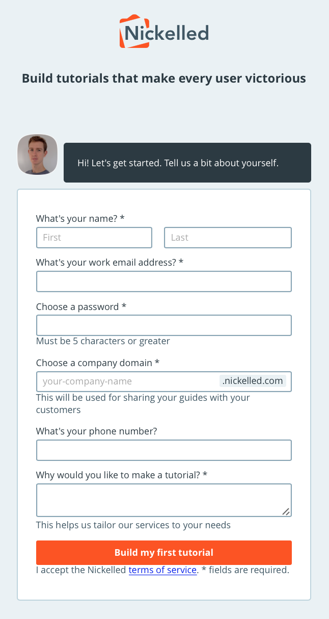
A valuable exercise is to place yourself in a specific customer’s shoes. In our case, we were able to imagine that we were a medium-sized SaaS business who wanted to get new user agents up-to-speed with an internal tool. How happy would we feel after the first ten minutes?
Not great, as it turned out.
In one case, a team member couldn’t proceed any further because of a browser issue. In another case, every one agreed that the clear next step after sign up (more on this later) was far too buried, hidden behind another screen. Oh, and we noticed that due to duplication across different sales and marketing tools, we were sending over six messages to new users when they sign up (something we wouldn’t have caught in dev).
As an example, here were a couple of things which we were on the lookout for when we signed up for our app:
1) Conscious questions that arise reading copy or interacting with the page
2) Unconscious niggles or pauses
3) Steps that feel like work
4) Items that could intelligently default but don't
5) App copy which feels disjointed or cold – would you say each instruction in person to a brand new customer?
It’s a valuable habit to start noticing these in other people’s apps as well. Compare their onboarding experiences to yours – how quickly did you feel satisfied with their product, and how long did it take with your own?
2) Remove Steps To First Valuable Action
The purpose of signing up ourselves was to improve our understanding of the issues that face the user.
Next, we focused on tackling them by ruthlessly removing steps between the sign up form and the first valuable action that a user performed.
Take the post-signup page.
The immediate page a user sees after signup should be a 'bridge to value’. That means that its sole purpose should be taking the user closer to the reason that they signed up in the first place.
For a social network, that may be finding friends. For an accounting app, it may be connecting a bank account. Whatever the next step after signup is, it needs to be 100% dedicated to helping users find success with your product, and it needs to be a small step. Immediately after I sign up isn’t a good time to ask me to make a leap of faith.
Our original post-signup page was a great example of how not to do it. After signing up, we redirected users to a page which told them to go and download a Chrome extension in order to get any further:
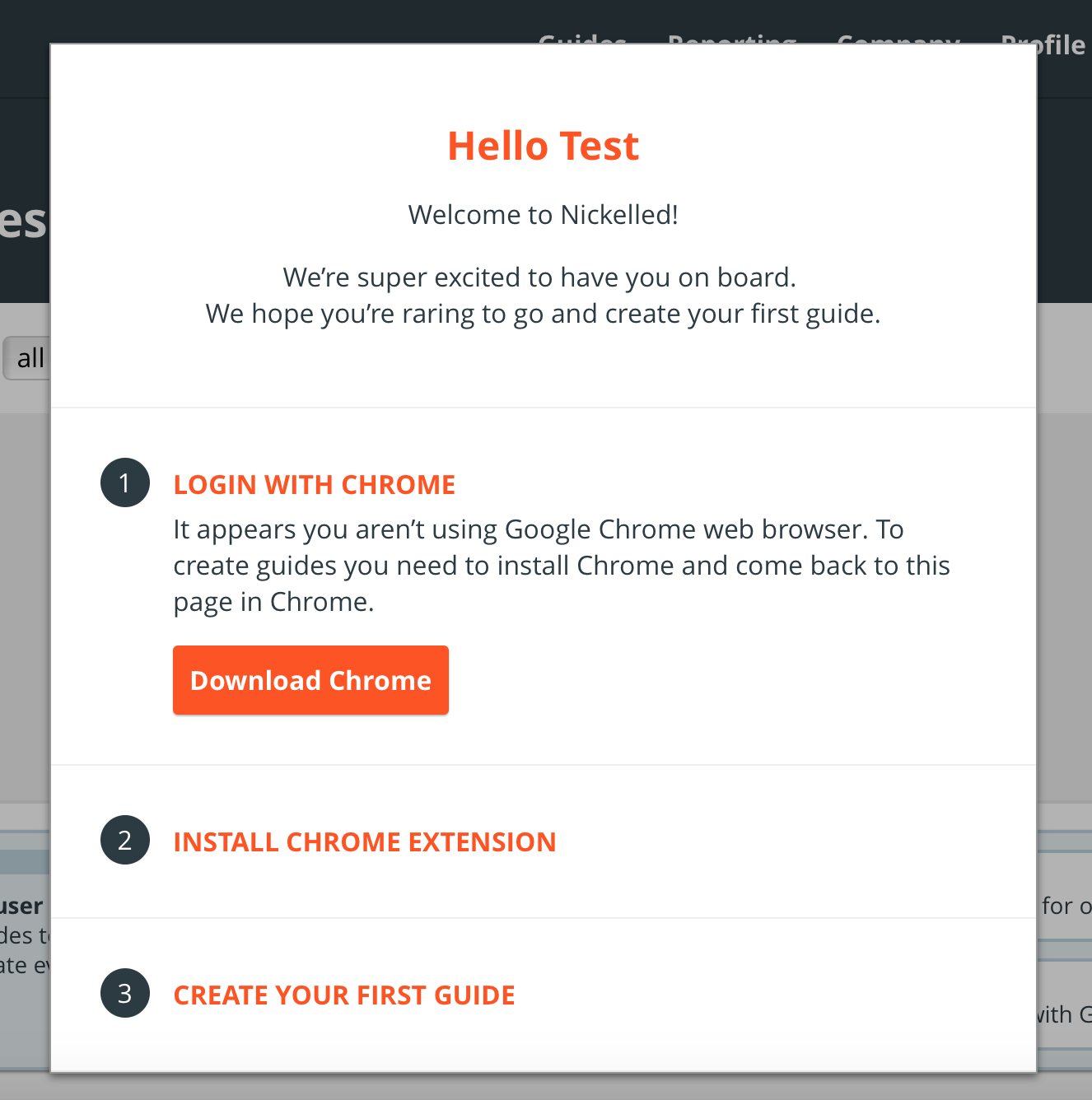
Wah-wah.
There were a few problems with this. One, not everybody uses Chrome, which meant an unpleasant, jarring effort for about 40% of the people who landed on the page.
Secondly, not everybody wants to download a browser extension immediately after handing over their username and password to an app they’ve never heard of – it was a huge ask, and nearly 50% of users wouldn’t bother going any further.
Our new flow had significantly less friction. Instead of pushing the Chrome extension, we offered users an option to head to our browser-based create tool, so that they could compile a guide right away.
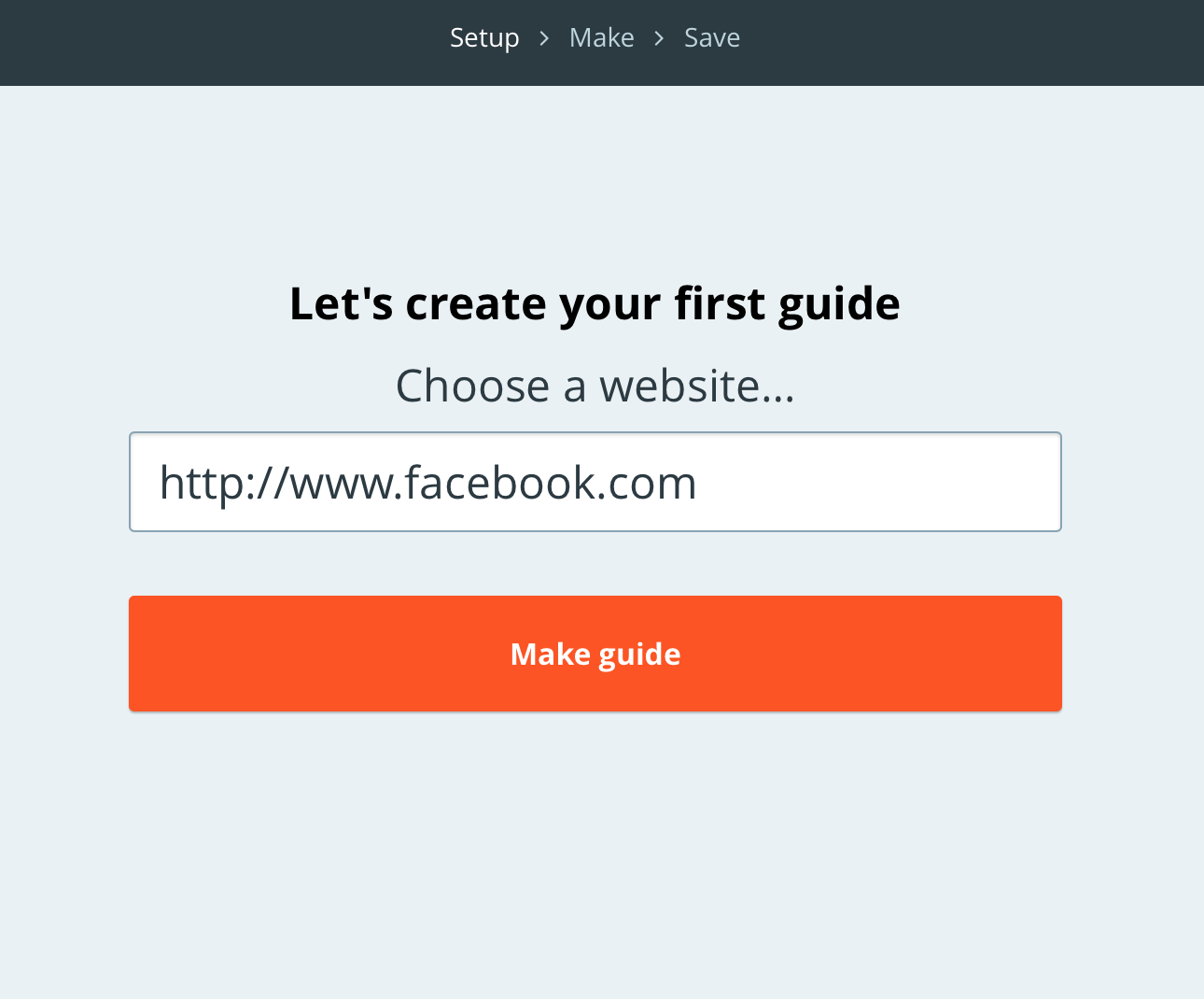
This significantly boosted engagement and the percentage of users who started building a guide after signing up – we’re still measuring, but it looks like the boost is in the region of 30%.
Not every SaaS app requires a browser extension, but plenty ask for additional steps before permitting a user to continue.
Examples such as confirming an email address are commonplace in the landscape – and they’re not a good answer to the question ‘what is the most valuable thing my user can do after signup?’.
————————————————————————————————————————-
Common friction points to consider removing:
- Filling out additional profile information
- Requirement to verify email address
- Invitation to invite team members
- Mandatory help tours
- Theme personalisation (unless critical to customer success)
- Any more forms (e.g. where did you hear about us, what do you want to achieve)
- Social sharing modals
————————————————————————————————————————-
Lincoln Murphy has some fabulous content on this, by the way, including this great article on The Fiction that Friction Improves Customer Onboarding and The Secret to Successful Customer Onboarding.
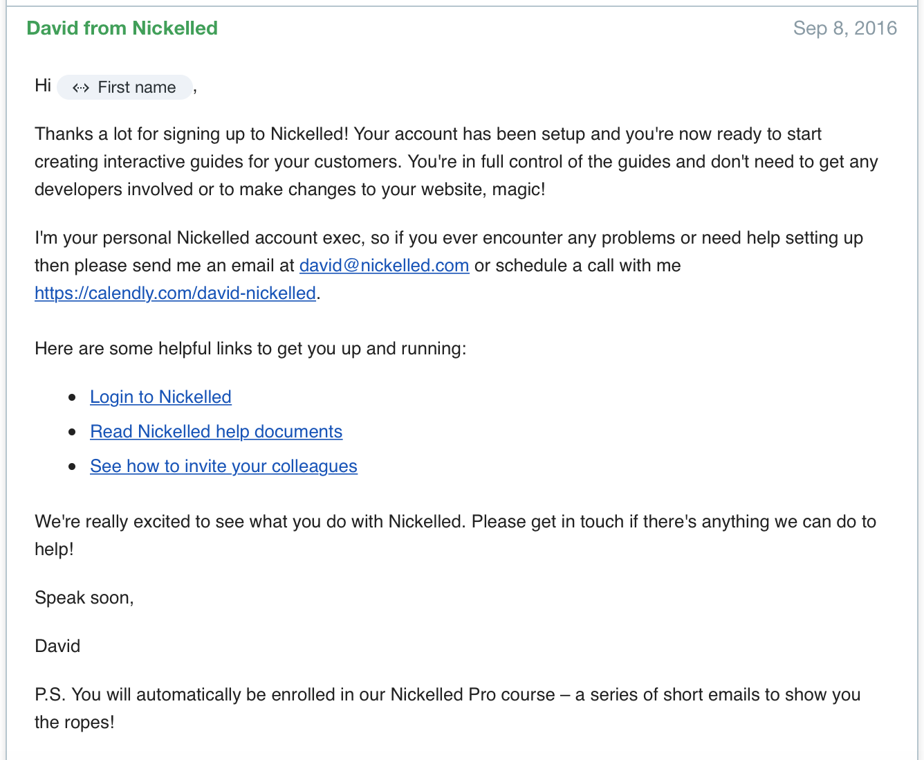
3) Rewrite the welcome email
Up until last year, our welcome email wasn't all that far off this:
Welcome @user!
You can confirm your account email through the link below:
Confirm My Account
Thanks for joining!
Sadly, we weren’t alone. The vast majority of SaaS businesses pay no attention to the welcome email, often leaving it as a barely-disguised tweak of the system default.
However, the welcome email is prime real estate. It generally has the highest open rate of all lifecycle emails, because the app is top-of-mind with the user when it’s received.
So why do so many companies waste this opportunity? Often, it’s down to the belief that the welcome email is treated in parallel to the user’s app experience – e.g. “the user will be in the app when they receive this email so I may as well engage them there”.
Thinking this way obscures the true possibilities of the welcome email.
Because while the fact may be true, it fails to take into account that users will generally read the email after their first user session with the app is complete – and is therefore a perfect opportunity to drive them back.
Our welcome email now, while not perfect, is far more useful:
And though we’re still iterating, this version has an engagement rate of around 30%.
————————————————————————————————————————-
Our advice is to make sure onboarding emails follow these four simple rules:
1) Ensure it has a benefit-driven subject line
2) Remind the user why they signed up
3) Break any asks into bite-sized tasks
4) Include a strong call to action.
More tips on how to craft perfect onboarding emails? Check out our ebook. You can also find a superb compendium of welcome emails in Encharge's post here.
————————————————————————————————————————-
4) Use Amplitude
Seriously. Just do it.
For the uninitiated, Amplitude is AWESOME. It’s free, which is about the most AWESOME price out there, but it’s one of the most powerful tools you’ll use for onboarding.
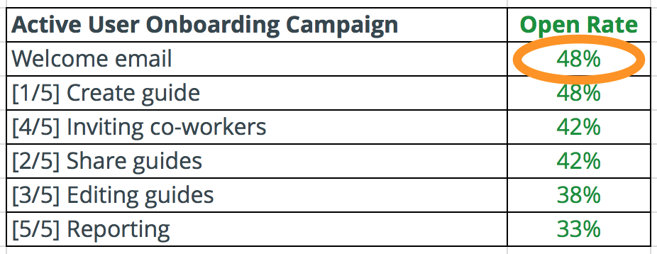
Amplitude makes tracking user progress through your onboarding funnel a breeze – events are fired for each stage of the funnel so that you can easily see which parts have the highest drop off rates.
For example, a welcome funnel may look something like this:
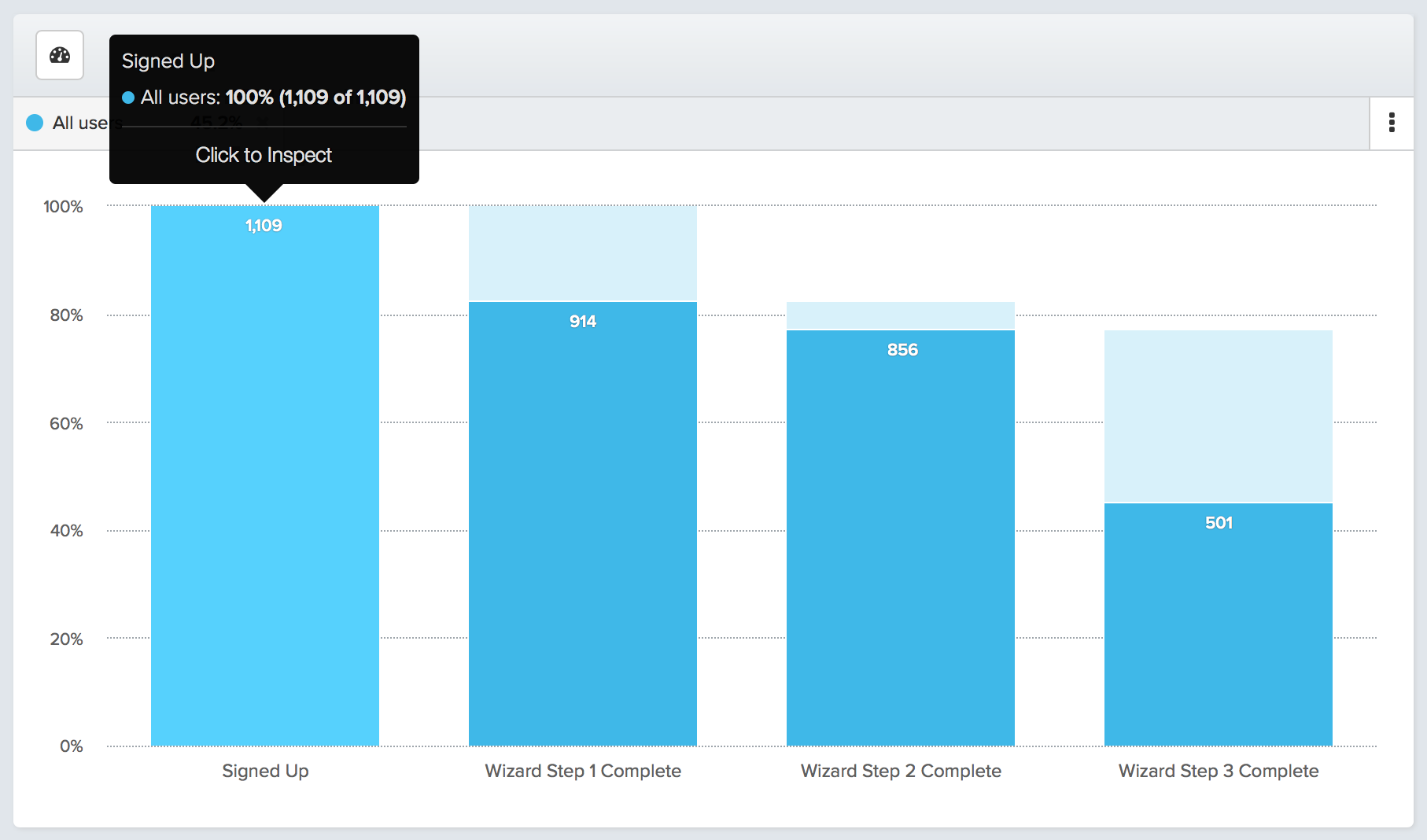
In the case above, the welcome funnel was absolutely killing new user activation – less than half of users were getting all the way through and we could see that they weren’t extracting value from the product nearly fast enough. Without Amplitude, it would be difficult to know which step was causing the problem, but with this kind of insight, SaaS businesses can quickly remove the roadblocks to success (in this case, step three).
In addition, Amplitude funnels can be analysed by user attributes and by time taken:
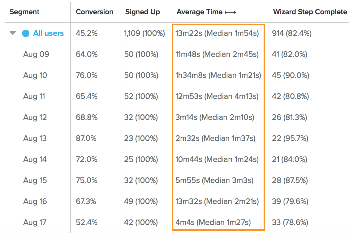
This allows us to identify steps which, on average, take key groups much longer and may therefore be problematic.
Perhaps I’ll blog more fully about Amplitude in the future, but for now, just go set it up. You’ll thank me, I promise.
How to apply this to your business
As I said at the start, onboarding is about incrementalism. Very rarely is there a magic bullet that can suddenly increase user engagement or ‘fix’ onboarding.
But incrementalism works best in a flow of constant iteration, so the most important thing that you should take from these ideas is that starting to improve isn’t difficult.
And there’s no better time to start than today.
