
When considering how to introduce users to your app and its functionality, an app walkthrough can be a key tool to help your user experience and appreciate the value of your app.
App walkthroughs are commonly employed as part of an onboarding flow for new users, but they can also be used for other purposes – such as introducing new features on an existing app or providing self-service help resources for commonly asked questions about an app.
In this post, we’ll provide some expert tips on how to make great app walkthroughs.
The 4s Of Great App Walkthroughs
In almost every case, great app walkthrough has the 4S:
- Simple. It leads to an app’s most valuable features based on new user data.
- Succinct. It uses minimal text and intuitive visuals to show the app’s function.
- Short. It doesn’t overwhelm the user or takes too long to accomplish.
- Smart. It helps retain new users and turn them into loyal fans.
Why Do I Need An App Walkthrough?
Unused features are an issue
The research speaks for itself. For enterprise online tools, approximately only 7% of their features are always used, 13% often used, 16% used occasionally, and a whopping 64% of a tool’s features are rarely used.
For mobile apps, users aged 21-30 have an average of 67 apps on their phone, of which they actually use 25. While sometimes your UX can speak fully for itself, in many cases an app walkthrough can be the extra piece of the puzzle that pushes your users to take the leap from “downloading” to “regular use.”
An app walkthrough helps prevent this issue by teaching users how to properly use a feature and find the value out of them.
App walkthroughs can be a solution
Particularly if you operate an app that doesn’t play to commonly accepted paradigms of apps (a dating app or social network, for example, has an “established UX language” across that category of apps, so they may require less explanation) using an app walkthrough from a company like Nickelled can help your users gain confidence in using the app’s features.
Even if your app is easily understandable for users, an app walkthrough can also help in a different dimension by assisting your user through the first few actions that will allow them to find value in the platform.
Here are a few key tips to remember when determining how to design and approach your app walkthrough.
Know What Metric You’re Aiming For
What do you really want?
The first step in determining how to structure your app walkthrough is to decide what you want to accomplish by guiding them through a tour.
For example, maybe you want them to join a community on the app, upload an album of photos, or initiate a certain number of conversations with other users.
KPIs can help design and evaluation
Firstly, establishing these concrete KPIs can help you by focusing the target and breadth of your tour. By concretely defining what your goal is with your app walkthrough, you can better structure the information you’re looking for.
Secondly, defining your key metrics can also help you down the line by providing benchmarks against which to gauge the success of your app walkthrough approach.
Identify Your Aha Moment
What’s an “aha” moment?
An “aha” moment is the moment in which the user fully understands a key piece of information provided by your tour that they may not have found otherwise. It’s important to the user that some elements of an app walkthrough will likely seem obvious.
One example of an action seeming obvious is clicking a “your profile” label to navigate to your user profile. However, perhaps the “aha” moment in that example is showing the user a highly useful feature in the profile section they may not have found otherwise.
What do you do with an “aha” moment?
If your walkthrough encompasses several features, it’s a good idea to put what you deem the “most important” aha moments at the beginning of the tour to catch users who might start but not finish the tour. This is the moment when everything clicks and the person seriously finds the value in becoming a regular user!
Focusing on aha moments can be a great way to optimize for user success and happiness with your app, by showing users concretely what you have to offer. If you want to learn more, we have long-form guides on what makes effective user onboarding.
Every app walkthrough should be structured around an aha moment (or several). If, in considering your app walkthrough, you cannot figure out what an aha moment might be, it may be the case that you should restructure your walkthrough or even abandon it altogether.
When structuring their onboarding app workflow, Gengo focused on — among other things — creating a guided flow that allowed translators find the value in using its platform.

This resulted into a dramatic increase in the way translators stayed on the platform:
“The percentage of new translators who have become active within the first 12 weeks after signup was around 38%. For the last couple of months, it has fluctuated around our goal number of 60%, meaning that more translators are picking up jobs within a short period after signup.”
The power of an effective app walkthrough is to generate these aha moments through effective guidance.
Keep it Concise and Contained
Don’t overburden your new users
Even in the most operationally complex of apps, you should keep your tour as concise and to-the-point as possible.
Keeping it concise maximizes the value your app walkthrough has to your customer. It does this by decreasing the expectations you might have of them on going through an elaborate app walkthrough.
Users are less likely to complete tasks that “ask a lot of them” and their attention, particularly before first really using the app and getting a good feel for its value.
How to keep it simple
- Keep any help text you have in the walkthrough at a low word count for maximum easy visual scanning. People are less likely to read longer paragraphs than shorter ones.
- Don’t have too many steps in your walkthrough. While there’s value in being thorough in your information provided, many users may tire of your walkthrough and exit it midway through if they feel it is dragging on.
Asana does a great job of keeping their app walkthrough concise, focused, and useful to their customers.
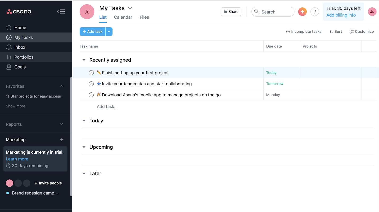
Asana as a project management platform is understandably complex, as far as these platforms go. But it simplifies the whole process by providing intuitive nudges on where to go next based on action priority. When just starting out, users are presented with predefined tasks to complete that are all related to project management:
- Set first project
- Invite teammates
- Download Asana
At the same time, the help authoring section is also prominently shown in the top-right side of the platform, providing easy guidance any time the users feel stuck. These smart app walkthrough tactics help facilitate the onboarding process without overwhelming new users.
Remember Your Walkthrough Is A Product Too — Optimize It
Don’t be too confident about your first pass
While it may be tempting to “set it and forget it” with your app walkthrough, the reality of the matter is that your walkthrough is a user-facing product the same way the rest of your app is.
Because of that, you should treat it the same way you treat the rest of your product. That means testing, gathering data, and tweaking as necessary to ensure it’s providing the maximum possible benefit to your customers.
What to be wary of
Issues to watch out for in particular are:
- Mid-tour dropoff or opting out; that might indicate your app walkthrough itself is an unpleasant user experience.
- The risk of not hitting the KPIs you set to measure the success of your tour. Ideally, you should see marked changes in user behavior as an effect of your app walkthrough.
Make App Walkthroughs Visible And Fun
This may seem obvious, but it’s surprisingly easy to get wrong. When designing your app walkthrough, it’s important to make sure your visual prompts are, well, visible.
When prompting someone to take a given action in a more cluttered or “busy” page, your prompts should always be prominent even if they border on ugly or overly intrusive. That may mean any number of things, including:
- Large-font help text
- Bright, unmissable colors
- Large call-to-action buttons
- Using coach marks to gamify the app walkthrough experience
Apps like Nickelled can provide prominent prompts to users that also integrate closely into the rest of your app experience.
If the prompt you are trying to highlight may require some scrolling to reach in some screen formats, you should ensure that you auto-scroll to the prompt to reduce user confusion.
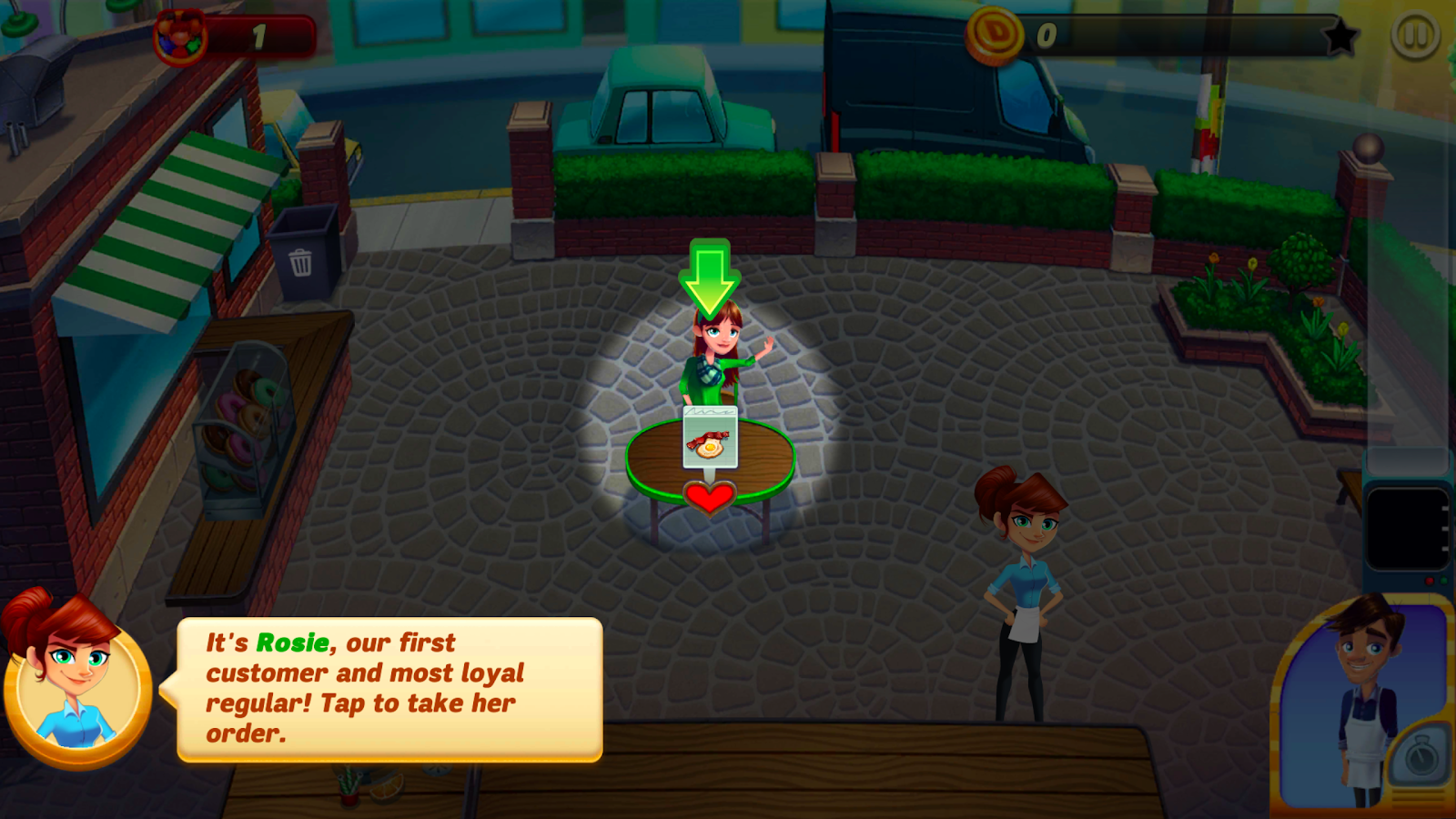
An example of an app that does this well is Diner Dash.This mobile game has created a simplified level that allows users to clearly walk through gameplay in a controlled, focused way to learn the game.
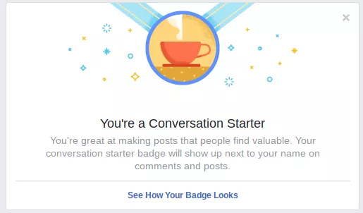
Games, in general, can provide inspiration on how to structure your app walkthrough in fun, effective ways. Facebook, for example, has a rewards system based on initial engagement:
Let’s also not forget one of the pioneers of gamified app walkthroughs, Foursquare. This travel app essentially gamified the whole experience of visiting places from the very beginning.
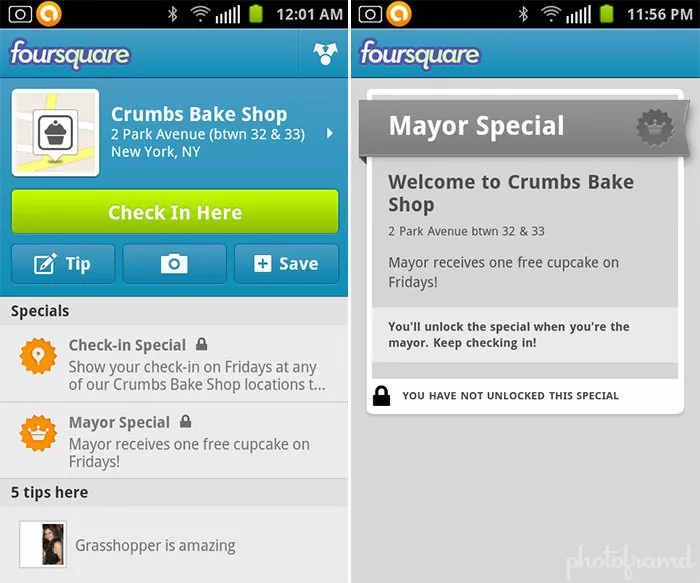
Everyone wanted to level up and become a mayor, so they kept using the app repeatedly. This helped Foursquare grow 10x in just 5 years. Today, many travel apps, notably Google Maps, have since borrowed elements of this gamified app walkthrough to onboard users.
Let Your Users Opt Out
Opt-outs are a necessary evil
Although we’ve talked above about optimizing to reduce tour opt-out, you should always provide the option to opt out. Not everyone is going to want to complete your walkthrough, or even start it. There are many reasons this could be the case.
Why people might want to opt out
- Many people have aversions to app walkthroughs in general, and would prefer to discover behavior on their own.
- They might also be familiar with the app from another context, dismissing the need for any explanation.
- Other users might tire of the tour halfway through, particularly if it’s on the longer side or hasn’t been fully optimized to reduce drop off.
Unless you provide users an “out” from your tour when they want it, they may become frustrated that they are required to complete it, potentially frustrated enough to drop the app entirely.
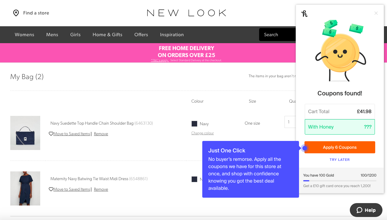
An example of an app that allows an easy opt-out is Honey, which allows the user to cancel out of their pop up window at any time during the tour if they so desire.
Use App Walkthroughs to Increase Your App’s Chances of Use
Like we mentioned before, most apps that are downloaded are not actually used regularly. Given that, it’s important to give your chance the best shot at capturing and informing your customers of your value as much as possible soon after download.
There are many ways to get to this same end goal, including optimizing for good UX and informative product launches, but at the end of the day users oftentimes won’t know the value of a given app or feature unless they have been fully exposed to it.
Walkthroughs give you a chance to prompt your users down a concrete path towards finding and using your app.
Use Nickelled to Create Simple, Yet Powerful, App Walkthroughs
And it isn’t even difficult to do—apps like Nickelled allow you to easily integrate app walkthroughs into your flow (on multiple platforms from desktop to mobile) without the need for development effort. Nickelled even provides a free trial that can help you experiment and fully determine whether an app walkthrough is right for you.
Once you experiment a bit with using app walkthroughs for your products, you’ll begin to concretely see the value an app walkthrough can have towards your overall app KPIs. Although a tour might seem simplistic, you should never underestimate its power when done well.
