Cohort Analysis: The Definitive Guide
In four years of SaaS business, cohort analysis is one of the most underused tools we’ve seen.
Yes, we know sounds complex. We know it's not as easy as a line graph. And we know that setting it up sounds like a pain in the a$$.
But here's the deal:
Understanding it can help you to boost retention, cut churn and ultimately grow faster.
And so, we've written this five-page guide… Because this is a skill that modern SaaS entrepreneurs, product people and marketers just HAVE to master.
Why you’ve been doing usage analysis all wrong
If you’re anything like 99% of SaaS businesses, you’re a sucker for numbers.
You know that SaaS is a great business model precisely because it’s so mathematical – you only need four metrics to get an immediate handle on any business (acquisition rate, average revenue per user, lifetime value, and churn).
And so you’re probably spending a lot of time diving deep into numbers - compulsively checking out Google Analytics, building funnel reports in your favorite dashboard software and obsessively tracking events using Segment.
Most SaaS businesses do this. And broadly, it’s a good thing – making decisions based on numbers is better than making them based on nothing at all, right?
But here's the secret to understanding the importance of cohort analysis:
Time-based analysis is HORRIBLE at providing useful information to a business that is moving fast.
This chart, for instance, gives you an immediate view of your conversion rate this week, compared to previous weeks:
Graphs such as the above are fine for some types of business, but for highly iterative web businesses (which most SaaS companies are), they’re virtually useless.
This one shows weeks and weeks of data, and provides literally no context on what was happening during that time.
What changed in the business in the high-converting weeks vs the low converting weeks? How many new product features were added or removed? Who signed up?
The fact is, we don’t know.
And when you’re making multiple product changes every week, if you want to improve, these are things you need to know.
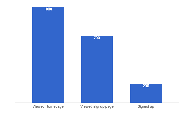
Take this next one, which at first glance appears to give a pretty good insight on what needs to be improved in your funnel:
Interesting, right? We have a massive drop-off in users who hit the Signed Up page, so clearly something there needs changing.
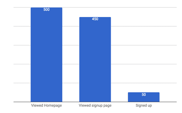
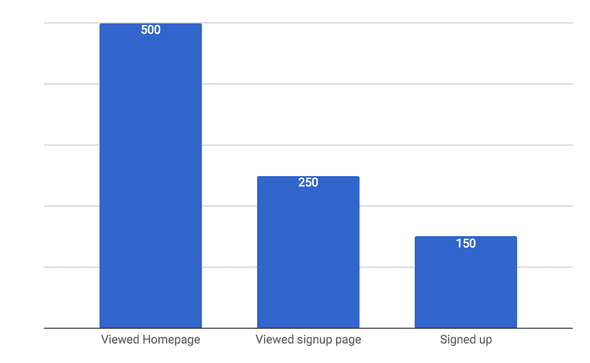
But wait. That graph contains four months' worth of data. And at the end of the second month, the product team made a significant change which changed all of the metrics.
So in fact, the graph above could be plotted as two graphs, like this:
Oh s**t!
What we thought looked like solid data isn't actually that solid at all, because two months in, a massive change was made which skewed the first chart.
I could go on for ages about this, but you get my point; time-based graphs often aren't helpful in decision-making for SaaS businesses.
We need something else.
Enter Cohort Analysis!
So, what if we essentially break down our workings to different groups of users so that we can compare and contrast?
The second example above is a simple form of cohort analysis because we split out the results into two groups.
Normally, you'll be looking at more cohorts than two, but the principle is the same; you can gain far more valuable data by comparing and contrasting different GROUPS across different TIMES.
Wikipedia defines cohort analysis (which will occasionally be called 'panel studies' or 'longitudinal studies') like this:
It also gives us some great clues as to why it's so important:
Cohort analysis allows a company to “see patterns clearly across the life-cycle of a customer (or user), rather than slicing across all customers blindly without accounting for the natural cycle that a customer undergoes.”
Although cohort analysis is now most widely-used in online business and analytics, it has its roots in medicine; 'cohort studies' are the name given to studies of distinct groups of people that take place over a far longer term than would be possible in a randomized controlled trial.
The British Doctors' Study, which ran from 1951 to 2001, is one of the best-known examples, having used data from multiple cohorts (including birth, gender and smoking habits) to conclusively prove for the first time that smoking increased the risk of lung cancer.
Medical researchers tend to refer to cohort studies as prospective – i.e., whether the cohort study identifies the cohorts at the start of the study and then proceeds to study them - or retrospective – i.e., when the historical data is already available and can be analyzed retrospectively.
Thanks to the amount of data collected on customers, most businesses can now run reasonably accurate retrospective cohort analysis (if this doesn't apply to you, it may be time to examine which customer success metrics you're tracking).
A simple cohort analysis example
To kick off this guide, we'll show you a ridiculously simple example, with an accompanying Google Sheets file.
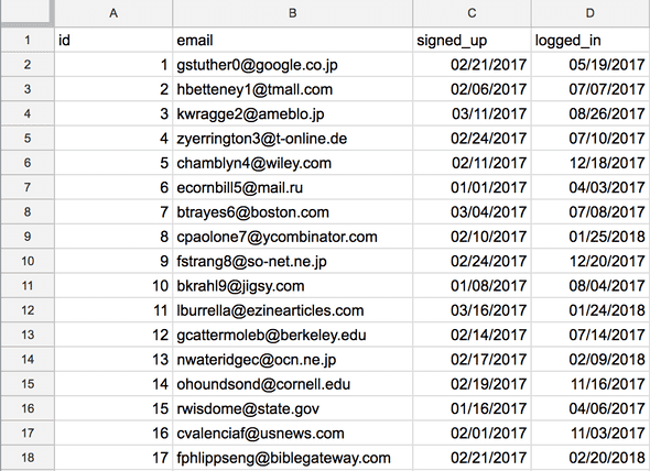
Take a look at the following group of users, with their signup month and dates of log in:
Plotted on a chart, this data looks like this:
Which is a basic cohort analysis. The cohorts are months (on the x axis) and they're placed in buckets on the y axis to give an indication of when they last logged in.
We can already see some interesting trends in this basic table.
Users in February, for example, didn't come back at all in May 2017, compared to users in January. An immediate question for the business, then, might be what changed from January to February's cohorts that might account for this loss of the 'stickiness' of the site. And how was it recovered in time for March?
We call this stickiness retention, and it's one of the most common reasons to use a cohort analysis (though by no means the only one).
Type of cohorts
The British Doctors' Study referenced above illustrates one of the most powerful aspects of the cohort study – the ability to group subjects in different types of cohort to extract different results.
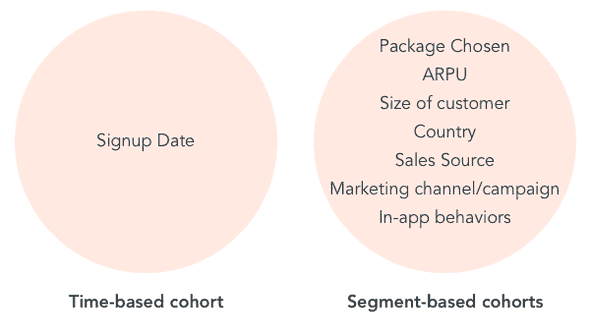
Running a SaaS business, there are various types of cohort that might prove useful, broadly referred to as time-based cohorts and segment-based cohorts:
Although many businesses will start using time-based cohort analysis (partly because it's built into several tools), there are compelling arguments for going more in-depth than the signup date.
In fact, over many of the clients we've worked with, time-based analysis has been among the LEAST useful types.
Why? Well, knowing the behavior of distinct groups by when they signed up is really only relevant if you've made huge changes that affect that group only (for instance, a new user onboarding flow or a marketing campaign which ran over certain dates). Often, it can be a struggle to isolate comparable time-based cohorts for these examples.
Furthermore, time-based cohorts are superb at giving you details of what happened in the past, but you can't get a user to sign up three weeks ago, right? The environmental factors that affected a signup three weeks ago may not be present today, which means that data isn't particularly actionable.
Introducing segment-based cohorts
Segment-based cohorts, on the other hand, allow you to isolate factors that ARE repeatable and actionable.
For instance, if you run a Facebook and Google marketing campaign and cohort your users according to which campaign they arrived through, you might find that Facebook users are far less likely to stick around than Google users.
This data is dynamite – and infinitely more actionable, because you can easily scale your marketing efforts on Google based on these insights.
From that point, time-based cohorts become useful again. Because by cohorting by both time AND campaign source, you should be able to see the effect of your enhanced marketing spend over time, proving that you're getting ROI from the first set of learnings.
Neat, huh?
How to do a cohort analysis
In the following sections of this guide, we're going to take a much closer look at how to run an analysis for various purposes, using different tools.
Right now though, we'll take a quick look through the principles behind the really basic example above, so you know exactly what your tools are doing once you start building more complex analyses.
Cohort studies consist of three key phases:
Design: set up the study to ensure that a key question or hypothesis is being tackled (e.g. "did users who signed up in March spend more money than those who signed up in February?")
Cohort: Split the users out in such a manner that the question above can be answered
Study: Compare the cohorts to find the answer, testing against a control group if required
Assuming we want to stick with the design question above for our simple, manual cohort analysis, there are some other steps we'll take to complete things in the most basic way possible.
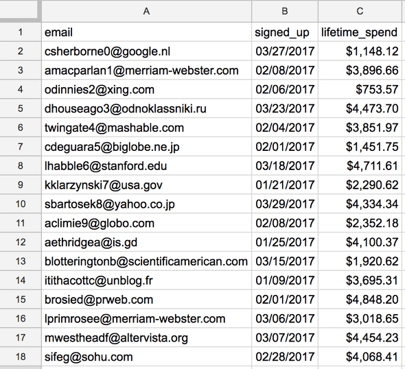
First, we'll create the cohorts. In the table below, you can see that we've got users (column A), listed by signup date (column B), with the total that they've spent with us (column C).
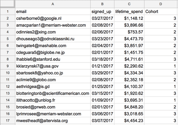
First, we'll add the cohorts in manually, putting users who signed up in January in cohort 1, those who signed up in February in cohort 2, and those who signed up in March in cohort 3:
Now, all of our users belong to one of the three cohorts. Now all we need to do is to average the spend for each group:
And we can see that in this extremely simple example, cohort 1 (the group of users who signed up in January) spent the most with us. Loosening the purse strings for the new year, perhaps?
View the sheet here (make a copy), if you want to see exactly how this was done in Google Sheets.
Technical Setup
In the next section, we're going to delve deeper into the mechanics of this for SaaS - specifically the three use cases to be aware of.
But before we move on, a quick word on technical setup.
Cohort analysis doesn't take much, as we've shown above, but if you want to take it seriously you'll need to think hard about what you're tracking in your app.
By default, most basic analytics software will only track retention, which is done by comparing user signup dates against the last-seen date on their cookies.
As we discussed above, to get the most out of cohort analysis, you should be tracking more than time-based retention.
Ensure that your analytics platform is capable of tracking and segmenting other traits. Many will be able to automatically tag users according to characteristics such as signup source, location, device, browser or operating system.
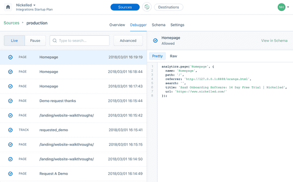
To go one step further, you need to implement event tracking using a platform such as Segment, which allows you to log specific actions against individual users:
This allows you to get far more granular and customized with your cohorts, running analysis on attributes such as package, billing cycle, custom actions completed, etc etc.
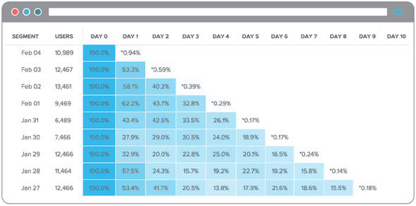
Once these are being tracked, it's pretty trivial to send them into tools such as Amplitude or Mixpanel, which can subsequently build beautiful analysis such as this (which shows a classic cohort analysis in Amplitude):
As an example, consider two cohorts, where one has uploaded a profile picture and the other hasn't.
If your cohort analysis tells you that users who upload a profile picture spend more money in total with your business, you're likely to want to incentivize them to add a profile picture, right?
That's the rationale behind getting more sophisticated with the technology setup required – over the long term, it'll yield greater insight that the basics offered by most software.
You just finished chapter 1! Congratulations! Now it's time to take your newfound understanding of cohorts and apply them to the world of SaaS, which is the next chapter.


