Cohort Analysis in Google Sheets
In this section of the guide, we’re going to build a cohort analysis in Google Sheets.
We’ll start off with some acknowledgements and caveats.
First off, we should point out that part of this guide is inspired by these excellent slides by our friends at GoSquared. We’ve used a different technique, but scroll down to the Advanced section to see why we liked what they did here.
We should also add while we run almost our entire business on Google Sheets, it’s not perfect for cohort analysis. In fact, it’s not even ideal. You’ll need some well-structured data and a good reason for not using the cohorting tools available in software such as Mixpanel and Amplitude (see the next section of the guide) before attempting the below.
But you’re a smart cookie who’s not afraid of a bit of data wrangling, right? Yes? Let’s dive in…
Structuring your data
In this guide, we’re going to assume that you want to plot retention, as it’s probably the most recognizable form of cohort analysis while also being the hardest to calculate. So if you want to cohort by something else (such as marketing channel), follow the guide anyway, and by the end of it, you’ll be overqualified for what you want to do…
We’re going to use a dump of DB data from Mockaroo, for no other reasons than it’s a cool tool with a cool name. We pulled out data with the following fields, which are intended to replicate the way we store event occurrences internally at Nickelled:
We’ll be plotting users against their last signup dates to see which months had the longest period of retention.
For simplicity, I’ve had all of the users sign up in the last calendar year, and we’re only tracking one login date (the last one). A more complex form of cohort analysis may take into account multiple consecutive sign-in dates (we’ll cover this a bit more later on).
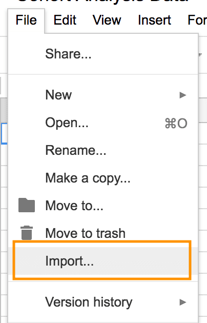
Let’s start by getting our CSV Mockaroo data into Google Sheets, using File > Import:
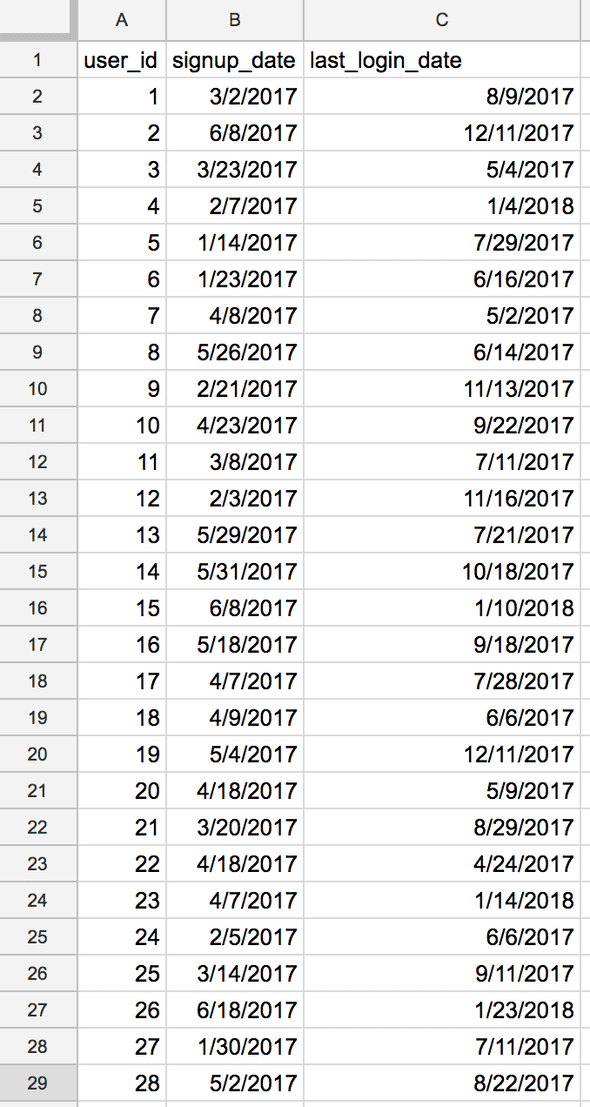
OK, that’s brought all of our users in, along with their signup date and last login date:
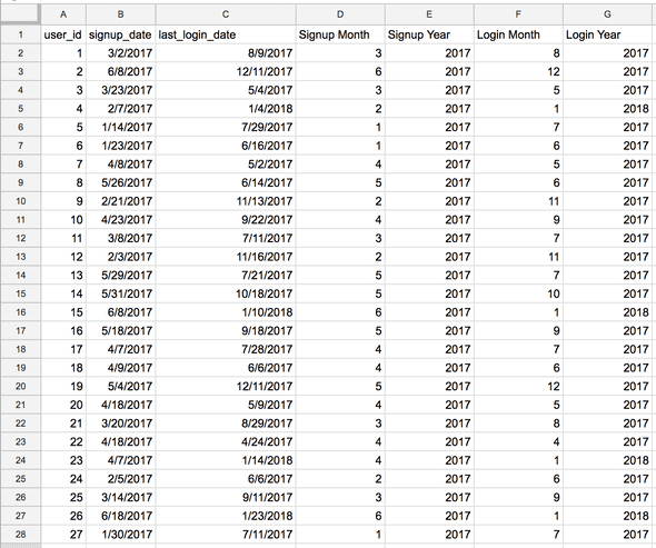
Next up, we’re going to reformat this data to group it. As we’re grouping by month, let's add four new columns next to the existing data:
Because of the way Google Sheets works, we need to break down the data a bit more before we can analyze it. We’ll use the built-in MONTH and YEAR functions to do this. Each one essentially returns ONLY the month or year from a specific date.
So, for example, if you enter the formula =MONTH(1/1/1970) into Google Sheets, it will return 1, to represent January in this instance, and so on.
So in cell D2 we’ll enter =MONTH(B2) to return the month of the signup date in B2, in cell E2, we’ll return the year with =YEAR(B2). Likewise in cell F2 we’ll return the month of the last login date with =MONTH(C2), and in cell G2 we’ll return the year with =YEAR(C2).
Paste those formulas all the way down, and you should have something that looks like this:
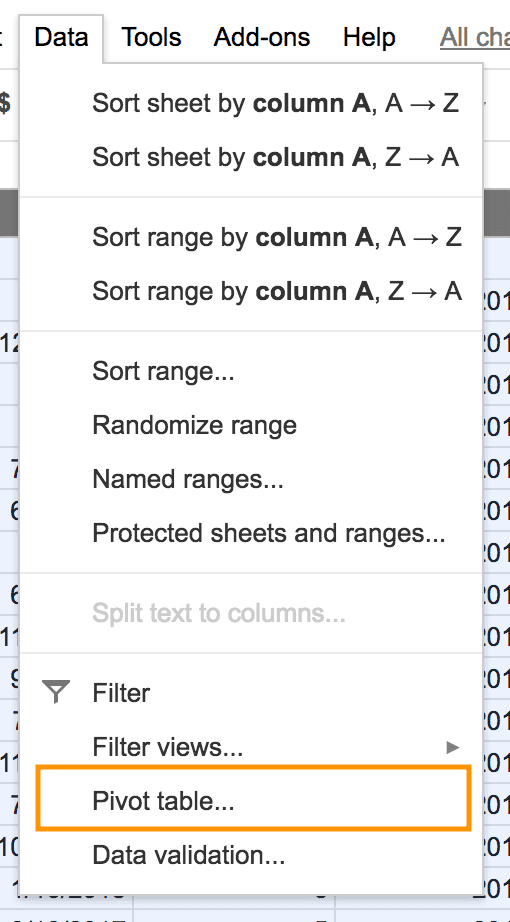
Super! Our data processing is now complete and we can build a pivot table that acts as a cohort analysis. Select the whole range of data and click ‘Pivot Table’ from the Data menu:
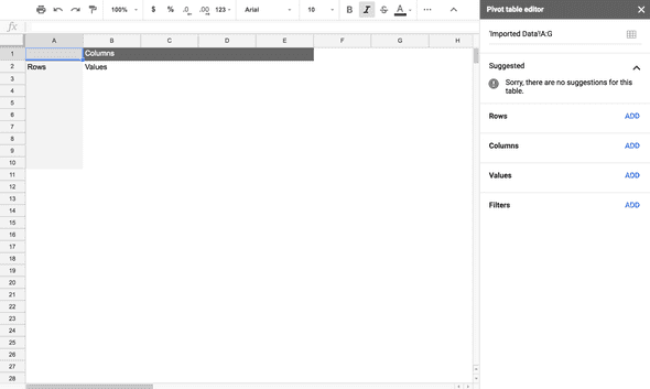
You should get an empty pivot table with the pivot table editor open at the side:
Now, we’ll just tell it what to pivot. Click ‘Add’ in the Rows section of the Pivot table editor and add signup year:
Then click ‘Add’ again in the Rows section and add signup month.
Next, click ‘Add’ in the Columns section and add login year. Do the same again and add login month. Finally, uncheck all of the ‘Show Totals’ boxes in the Pivot table editor, and your pivot table should look something like this:
What’s going above should be clear if you read the previous sections of this guide — on the left-hand side (the rows), you’ve got the signed up date, and on the top (the columns) you’ve got the date of the last login.
Now, we just need a whizzy way that can analyze our data on the first tab and fill in the numbers in the blank cells, right?
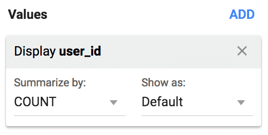
Google Sheets makes this very easy for us — in the Values section of the Pivot table editor simply click ‘Add’ and then select user_id. Make sure you select ‘COUNT’ in the 'Summarize by' menu; otherwise Sheets will add up your user IDs instead of counting them!
All being well, your pivot table should now look familiar:
Hey, it’s a cohort analysis in Google Sheets! Super cool, right?
Now, we’ve seen a couple of other ways to do this online, including here and here. The pivot table approach outlined below is the easiest, in our opinion, as it doesn’t require any complex (read: easy to break) formulae and can be achieved using just basic Google Sheets functionality.
However, if your initial dataset is more complex, you might want to consider some advanced Google Sheet methodologies to achieve the same goal.
Advanced Google Sheets Cohort Analysis
Idea one
In this easy-to-follow presentation by GoSquared, Hugh Hopkins explains how to use SUMIFS to achieve a similar output as we managed above. In his example, the outline of the cohort analysis is built manually rather than automatically, and a series of concatenated IF statements is used to test whether the database line in question belongs in a given cell or not.
Idea two
In this analysis, Yemi Johnson achieves the same effect by calculating the difference between the two dates, and then using a pivot table to display the data. Yemi’s analysis is particularly worth a read because he’s accounted for there being multiple line-items with the same User ID (for instance, repeat purchases, or repeated logins) and automatically finds the last one for each user ID.
Idea three
Use a template where the cohort analysis is done for you, and you just need to fill in the right data in the right cells to have it populate. See the next section of this guide for one particularly good example from Christoph Janz.
Wrapping Up
You can access the Google Sheets template we used above here:
In the next section, we’re going to be looking at some advanced cohort analysis tools — we’ll see you there.

