Growth is no longer just about acquisition.
For too long, growth hackers have defined their success by how many users they can pull in, without paying close enough attention to what those users do when they arrive.
A user who signs up and doesn’t return is worth nothing — but retained users are the lifeblood of a healthy business.
Businesses should pay close attention to their onboarding flows for this reason, and this reason alone — though it can be difficult to know where to start, even if you're using user onboarding software liked Nickelled.
That’s why we’ve pulled out a couple of very different (but nonetheless great) user onboarding examples, in the hope of providing you with some inspiration to build something fantastic.
“Good artists borrow, great artists steal" Pablo Picasso
You’re welcome 🙂
User Onboarding Examples You Can Steal
Twitter: The Beast
Twitter’s user onboarding is a thing of awesomeness. It’s long, so you’re going to need some patience here. It’ll be worth it, we promise.
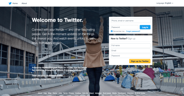
OK, we’re on the homepage. Nice and clear, and just three fields to get started! So simple…
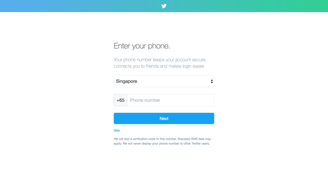
Woop, I’m now a Twitterer (as my Mum would say). I’ll skip adding a phone number here, because I’ve just signed up and I’m not sure I trust you with my data yet. Thanks for adding the skip button.
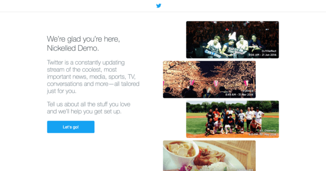
Sweet, I’m excited! This page makes me feel great about signing up.
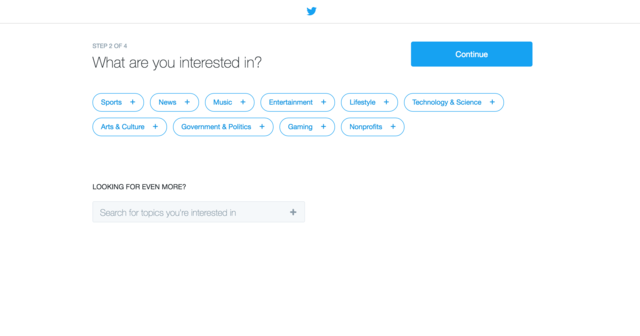
Alright, time to select what I’m interested in. Some nice clear buttons, with broad areas of interest – easy enough to choose. Let’s hit ‘Politics’.
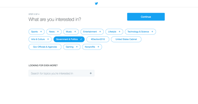
Whoa! Cool, now I’ve got some sub-topics in the form of #Election2016, United States Cabinet and Gov Officials and Agencies. I’ll select a few more and move on…
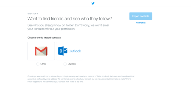
Hmmm, not sure I want to connect my Gmail. Again, the skip button’s nice and clear.
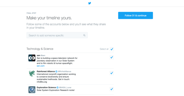
Whoa! Twitter’s automagically found 31 people for me to follow. Now, there are a few good things happening here.
1) Twitter’s smart, because nobody who’s pressed for time is going to sit there and deselect 31 checkboxes – so I’ll just hit continue.
2) By following 31 people, I’ve hit Twitter’s key inflection point. Take a look at this, from the now-defunct Growhack:
Josh Elman, Twitter’s product lead for growth and relevance until 2011, took a look at their usage numbers and realized that once a user follows 30 people, they’re more or less active forever. If Twitter couldn’t get a person to follow 30 other people, that person was very unlikely to ever come back.
This user onboarding process has boosted me to the point of lifelong user, and I’ve only been here two minutes. OK, I might not actually be a lifelong user, but I’m now tons closer.
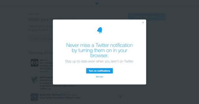
Alright, am I done? Oh – no. I’m asked to give them permission to send browser notifications. That’s a nice touch that’ll help with retention…

Wooop, here’s Twitter. And they’ve loaded an awesome-looking tooltip tutorial for me. It’s skippable, but nice and short, just five steps, and highlights all the key stuff I need to know about this screen. (Reminder folks, you can make these tooltip tours using Nickelled…).
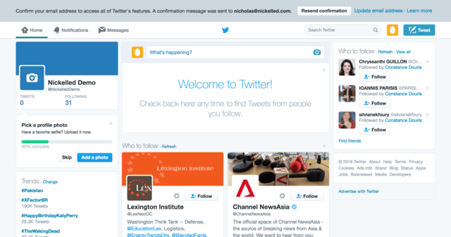
Alright, tour over. I can scroll down my feed and see what those 31 people are saying now. But wait… There’s a final little bit of optional user onboarding happening here. I’m already hooked, but there’s a way to make things even better. If I fill out my profile, I’ll increase the progress on that little green bar, and that’s going to make me feel great! So I’ll add my selfie…
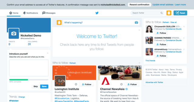
And I’ll write my bio…
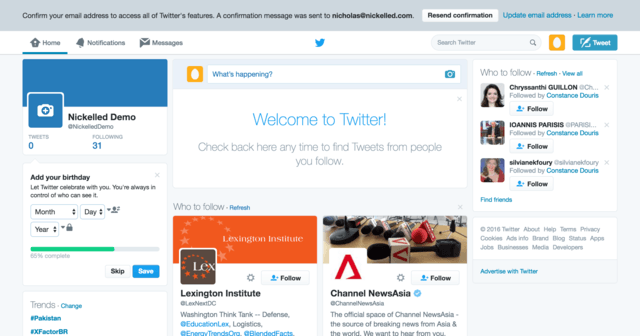
My birthday? OK…
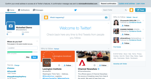
Location’s easy enough…
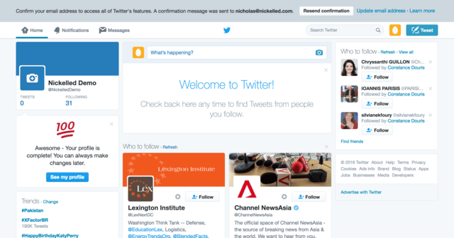
I’m done!! I’m at 100 (though it doesn’t really tell me 100 what…). I feel pretty great, and on the offchance that I’m not looking like I’ll be a lifelong user, I’ve just given Twitter all of the valuable information it needs about me to craft some pretty compelling retention emails:
- My email address
- My phone number (possibly)
- Permission to push notifications to my browser
- What I’m interested in
- My age
- Where I live
It’s a very long process. But from the point of view of both the user and the business, it’s a very, very good one.
Groove: Onboarding On A Diet
Groove is one of our favourite flows, because they’re pretty smart in using their own product to show people around. Let’s see how that works.
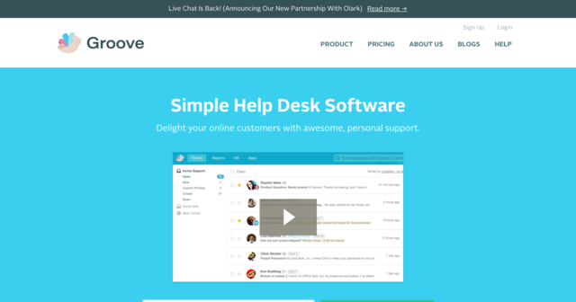
Signup is actually a bit tricky to find on this page – no big, clear CTAs above the fold like you see on many SaaS apps. We’ll click that serrupticious little link at the top.
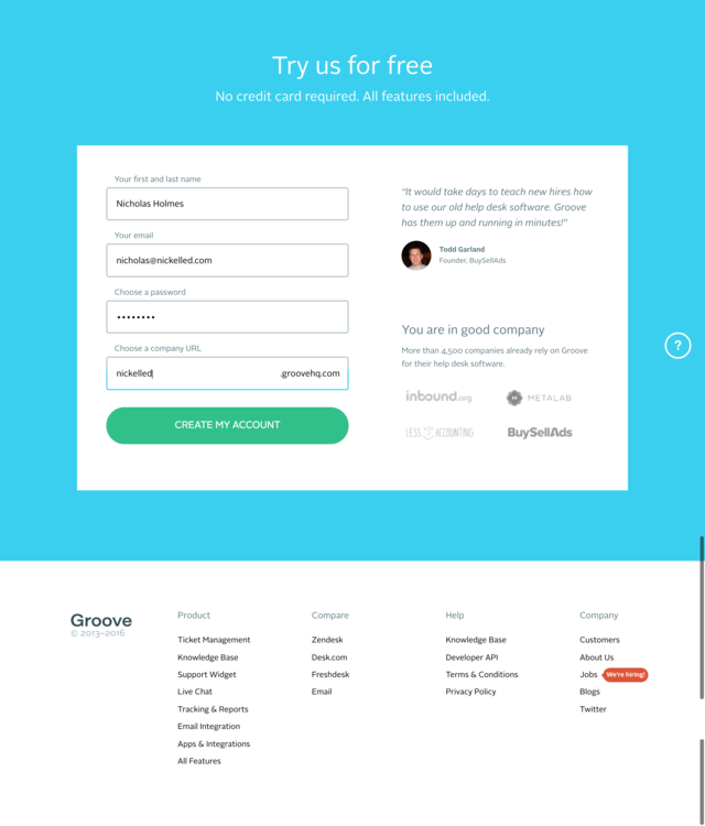
This is more like it. Huge boxes, really simple to use – it bodes well for my experience using Groove. Also, there's some compelling social proof on the right there. Let’s stick in our details (not much else to do here, which is a good thing) and continue.
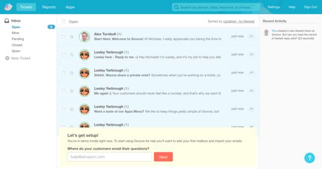
Alright! We’re in. That was super easy. I’m already looking at the Groove interface, and it looks a little bit busy already… But that’s OK, because there’s a big yellow box drawing my eye instead. It’s a setup wizard – and although it’s asking a slightly counterintuitive question for helpdesk software, they’ve helpfully filled it with a placeholder value for Amazon. Top marks Groove.
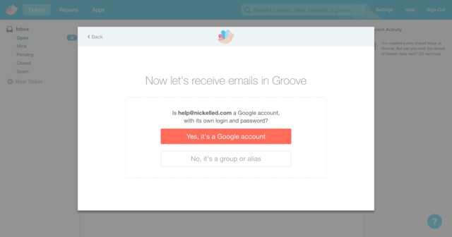
OK, so I put in my help email address, and we’re kicked into a modal. One very simple question – Gmail account or some other kind of alias. Mine’s an alias, so we’ll select that.
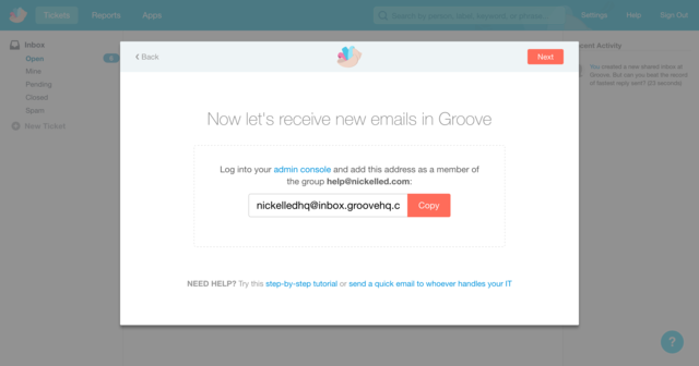
Aha, I need to forward some stuff. We’ll do that leater, but this is wonderfully clear. Let’s continue.
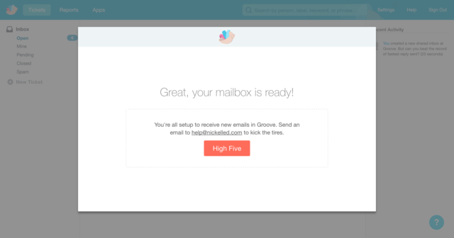
I’m finished! What a short wizard. Yeah I’ll high-five!
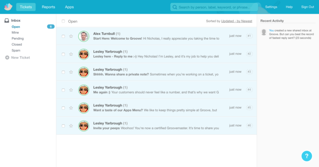
OK, we’re back in the Groove software, and this time, we don’t have a big yellow box for guidance. But now I’m paying closer attention to the screen, I can immediately see the next step for getting started, because it’s in the subject line of the first message that’s waiting for me. So I’ll open that email from Alex.
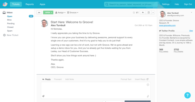
Cool! I feel welcomed, and now I’ve read it, I know what to do now – I’ve got to read Lesley’s email. This type of onboarding might now be for everybody because it’s pretty reading-intensive. But I’m a big fan.
Let’s read one of Lesley’s emails.
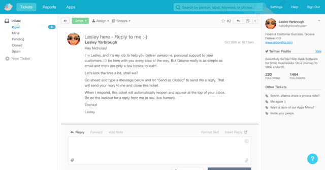
In this message, she’s pretty much showing me how the app works, which is cool. There are another five, but as I read them, I’ll be learning as I progress. Awesome.
Groove’s approach to onboarding is the opposite of Twitter’s – pretty lightweight (it’s accompanied by a comprehensive email course as well, which Alex blogs about here) – no guides, just a brief wizard and then we’re into the app. The best bit about it is that from that point, we’re effectively onboarding ourselves.
Typeform: Onboarding Anybody
Shanelle Mullin picked Typeform as a genius onboarding pick in this article, and I agree with here. Anybody who’s filled out a Typeform will know that their primary strength lies in ease-of-use, and their onboarding process is no different.
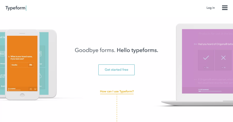
This large button prompts us to get started.
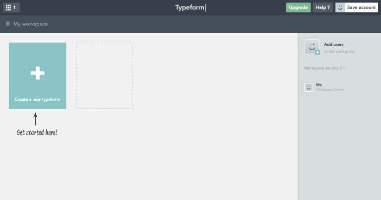
Click it, and I’m inside the app. This is awesome. Not a password box in sight, and I’m ready to get started with my first form. Plus, it’s nice and clear, with no opportunities for distraction. Thanks to that arrow, I know exactly where to click.
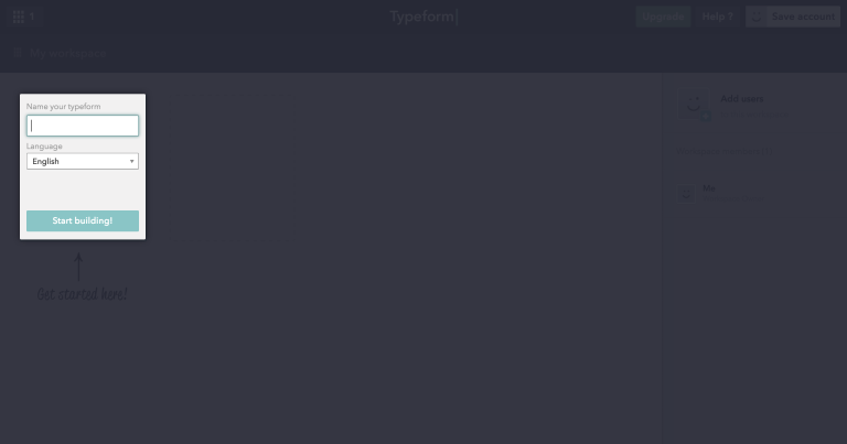
OK, I need a name, but there’s no page reload so that’s pretty easy. I’ll add one.
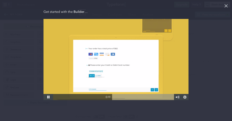
Whew! The form design window has loaded, but so has a modal with a video guide. I’m not a huge fan of video guides, but this one is pretty short (under a minute) and they’ve made it kind of cute.
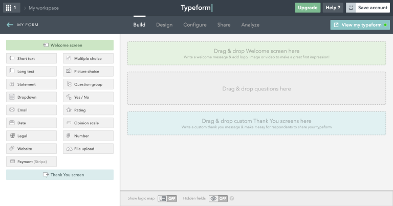
Whew, our form is ready – and I still haven’t signed up! I could run away right now and Typeform would never be able to catch me.
This screen is a little more complex, but the color coding helps. I know I need to drag the green to the green, grey to grey, blue to blue. It’s a nice touch, so I’ll start with my first question, by dragging a short-text question over.
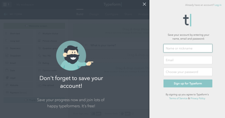
Cool! Typeform have realised that at this point, I’m pretty engaged. I’ve got this far and invested some time in my form, and so I’m unlikely to want to lose everything. So sure, I’ll enter my details to ’save’ my work! Note – "save", not "sign up”.
Conclusion
What’s strange about the first two examples is that the use cases for the apps themselves are the inverse of the onboarding processes. For the majority of its users, Twitter is a simple app – it’s all about writing and reading 140 character status updates. Groove, on the other hand, powers help desks which may have multiple customer service people responding to thousands of requests, as well as offering knowledge base software — technically, you’d imagine, a pretty tall order.
Why, then, is the Twitter onboarding process so complex? Most likely, because these apps are serving very different audiences, with very diverse purposes, but still need to push users to their “aha” moment as soon as they can.
Twitter welcomes users from all over the world, who probably want very different things from its platform — some may use it to communicate, some will user it to catch up on the news, some will be marketers looking to capitalize on an active audience, some will just be curious… and the list goes on.
Groove, however, primarily focuses on businesses who are looking for helpdesk solutions, and the customers featured on their homepage suggest that most of these are online businesses. This audience is clearly more purpose-driven and more technically savvy — so Groove can cut out the obvious bits from its onboarding and focus on getting the user to complete key activation events (like linking emails) faster.
Typeform, I suspect, sits somewhere in between, just like its onboarding process — a little more detail than Groove’s, but nowhere near as much as Twitter. What’s neat about Typeform is that their process, like their product, is very low-friction, so I can progress all the way through to my form without needing to hand over any details.
Which do you think is best?
Bonus Content
Need more inspiration? Tons of other people have taken the time to write some great teardowns of popular apps. Here's a quick roundup of some of the best…
UserOnboard
Samuel Hulick's UserOnboard remains one of the definitive onboarding resources, packed full of insightful teardowns from some of the biggest apps on the web. Check out his latest teardown of Hillary Clinton's campaign site, or browse others from the likes of Basecamp, Evernote, Apple Music, Netflix, Slack, Quora and more.
Link: https://www.useronboard.com/
The 5 'Best' User Onboarding Examples
Our friends at Appcues took a look at some of their favorite apps (Canva, Duolingo, Quora, Tumblr and Slack, if you're interested).
Link: http://www.appcues.com/blog/the-5-best-user-onboarding-experiences/
6 User Onboarding Flow Examples (With Critiques)
We referenced this one earlier – check it out for a close look at the onboarding experiences of Robin, Inbound.org, Evernote, Clash Royale, Flow and Typeform.
Link: http://conversionxl.com/6-user-onboarding-flows/
The 4 Best Mobile User Onboarding Flows We’ve Seen So Far
A strong mobile-only roundup from the guys at Apptimize, featuring RobinHood, Lookout, Peach and Inbox by Google.
Link: https://plank.apptimize.com/blog/2016/02/the-4-best-mobile-user-onboarding-flows-weve-seen-so-far/
