Cohort Analysis in Google Analytics
So far in this guide, we’ve covered the basics and the specific applications of cohorts in the SaaS sphere.
But in 2015, Google took a massive step towards making it useful for everybody, by launching the cohort analysis report in Google Analytics.
In this section of the guide, we’re going to explore how to use — and enhance — that report.
Getting started
First of all, you need to know that cohort analysis in Google Analytics is only available for properties that are using the Universal Analytics tracking tags. If you’re using the legacy tags (ga.js), you’ll need to upgrade before you can see the reports (although you should upgrade anyway, because there’s a ton of other stuff you’re not getting in the legacy version).
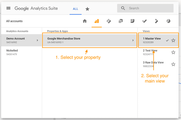
Once you know you’re on Universal Analytics, you’ll need to sign in, navigate to the right view:
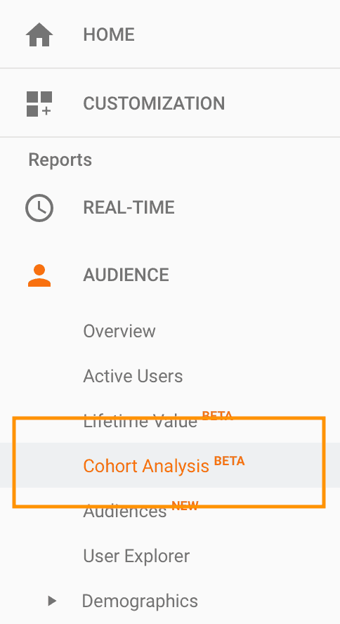
Open reports in the left-hand menu and select Audience > Cohort Analysis:
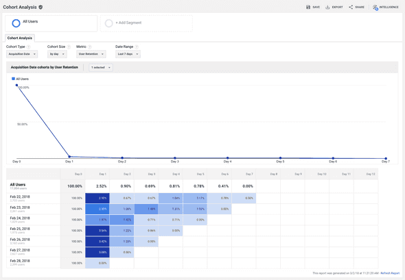
You should see a report that looks a little like this:
There are a few things to note in all of the screenshots you’ll see in this report. First off, we’re showing you this using the Google Analytics Demo Account, which is freely available and contains a ton of test data, so it’s ideal for showing off what Google Analytics can do. Bear in mind that your analytics account might not have so much data, and the results might not be as clear.
To get around this problem, you may be able to increase the date ranges to pick up on more general trends or increase the cohort size (we’ll examine how to do both of those shortly).
Basic Analysis
Before we dive into the more sophisticated stuff, we’ll take a look around the main cohort analysis report, so you’re familiar with what going on there. First off, this line graph at the top:
Ignore that! By default, it shows you a cumulative view of all cohorts, which isn’t a real cohort analysis. In this example, it’s merely telling us that retention is highest on day 1 and then falls away after that, which we probably could have assumed for ourselves.
The good stuff is all contained in the real cohort analysis, which is below:
Aha! Now things are getting interesting. What are we looking at here?
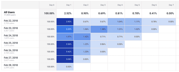
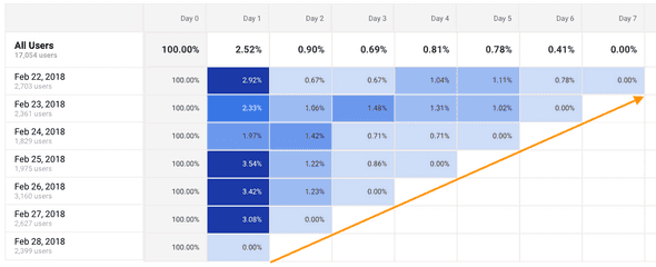
In the rows, you can see the users grouped by the day that they signed up - this is the total of the cohorts featured in the columns to the right. So in this example, you can see that there were 2,361 users who signed up on February 23rd.
In the columns, you can see the data for the individual cohorts. By default this is displayed by day — so, as an example, this report shows us that 2.33% of the 2,361 users who signed up on February 23rd came back on Day 1, 1.06% came back on Day 2, 1.48% on day three, etc.
You’ll notice the stepped effect at the bottom of the chart:
In case that wasn’t obvious, it’s created because today is March 2nd, so only users who signed up on February 22nd have had seven days to return. Users who signed up on February 23rd have only had six days, those who signed up on February 24th have had five days, etc. If you select a different time frame (more on that later), the stepped effect will disappear.
Finally, note the colors going on here. By default, Google Analytics will use five different colors to help you identify what’s going on with your data. The darkest colors represent the highest values; the lightest represent the lowest.
Take a moment to look again at the data above. What conclusions would you draw?
If you noted that it’s interesting that February 24th had such low Day 1 retention, we’d agree. Why would that be? If you also noted that February 23rd had an unusually high Day 3 retention, we’d agree with that too. Why did those users come back in their droves (kind of) after three days?
Taking an educated guess, this might have something to do with it:
February 23rd is a Friday. So it’s kind of understandable that users who arrived on a Friday were more likely to come back three days later (on a Monday) than over the next two days, which would be the weekend in most parts of the world. And those users who signed up on February 24th were taking a break on Sunday, which kind of makes sense too!
Going deeper
OK, now we’ve pulled out some basic conclusions, let’s make things a little more interesting.
At the top of the screen, you’ll have noticed a bunch of settings we can fiddle with to adjust our data:
In these menus:
Cohort type refers to what we’re grouping these users by (in this case, the only option is acquisition date)
Cohort size lets us set the size of the individual cohorts. In the example above we can see it’s by day, but that menu can also be grouped by week or month
Metric refers to the thing that we want to evaluate. By default, we’re looking at user retention, but we could also look at the average number of goals completed, for instance, or the total number of pageviews
The full list of available options includes:
- Goal completions per user
- Pageviews per user
- Revenue per user
- Session duration per user
- Sessions per user
- Transactions per user
- Retention
- Total Goal completions
- Total Pageviews
- Total Revenue
- Average Session duration
- Total Sessions
- Total Transactions
- Total Users
Date range allows us to set the range of dates we want to look at
A quick word of warning on the date range — when you’re looking at retention, Google has limited the lookback window by the size of the cohort you’re using.
If you chose a daily cohort, you can examine a maximum of 30 days, if you choose a weekly one you can examine a maximum of 12 weeks and if you choose a monthly cohort you are limited to a 3-month lookback window.
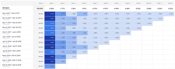
Let’s play around with some of these numbers to see what happens. Try changing the cohort size to week and the date range to last 12 weeks, and you should see something like this:
Now, because my analysis happens to have covered the holiday season, there are some interesting conclusions to be drawn. For instance, users who visited between December 3 and December 9th were more likely to come back in weeks 1 and 2. Perhaps because week 3 was the Christmas week?
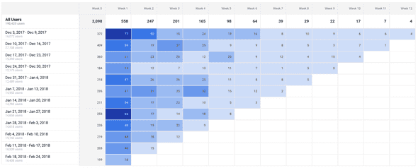
We might confirm this hypothesis by changing the metric to transactions:
Which yields this:
Perhaps unsurprisingly, the people who visited in that first week did have the highest volume of transactions in their second week of visiting the site — and here’s hoping they all got their deliveries in time for the holidays!
Being able to read the cohort data and apply some business logic like the above is critical to making the most out of the cohort analysis report. Understanding what your users are doing is one thing, but it’s useless unless you know why they’re doing it, which makes for far more valuable insight and allows you to start drawing conclusions that can help your business to grow.
At this point, however, you may have noticed the huge limitation of the cohort analysis report in Google Analytics — it only allows cohorts by acquisition date.
If you want to group your users by other segment-based cohorts, this report probably won’t do for you (but don’t panic, because we’ll examine more on this in Cohort Analysis for Google Sheets). Fortunately, there is a way to add some other groupings to this report.
Cohorting by segment
If you’re familiar with Google Analytics segments, you’ll know how powerful they can be.
If you’re not, think of segments are pre-defined groups of users that you can pull out across any Google Analytics reports (not just the Cohort Analysis). You may want to read a quick primer on segments here, before continuing.
Segments can be found at the top of the report — by default, there’s only one segment applied, and that’s all users:
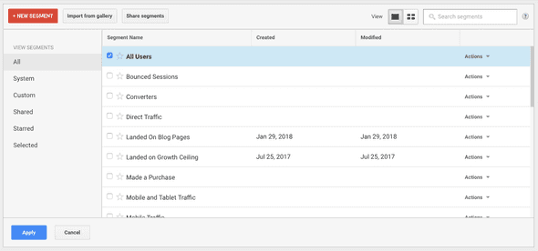
If we click on that grey “+ Add Segment” button though, we’ll get the list of pre-defined segments built into Google Analytics:
Arguably, the most powerful functionality here is the ability to build your own segments, but we’ll have to leave that for another day. Lets apply a new segment of “Mobile Traffic” and see what happens.
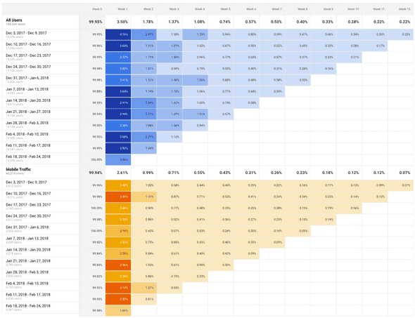
You’ll immediately see that we’ve got two sets of data now — one showing our original segment of All Users and the other showing a subsection of that, which is the users who were on mobile devices:
Helpfully, Google Analytics has told us the total user count for each (All Users is 188,046 users, but Mobile Traffic is only 66,219 users) and given the charts different color coding to make it obvious. Now we can easily see what mobile users do differently from the user base as a whole — but as our ‘All Users’ segment ALSO contains our mobile users, we’re not comparing apples to apples.
Let’s remove the All Users segment by clicking on the arrow next to it and hitting remove:
We’ll then add the predefined segment of “Tablet and Desktop Traffic” so we’ve got two distinct segments and we can pick out some clear differences.
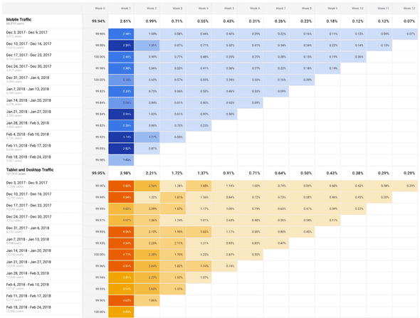
Which should give us:
This is interesting! We can immediately see that our mobile users are far less likely to return than users on tablet and desktop are. In every week since their original acquisition date, our mobile users aren’t coming back nearly as much as their counterparts on bigger devices.
This could be natural, but it could also be food for thought — how might we use this data?
One immediate thought: perhaps the mobile experience needs some improvement? We could combine this report with other reports such as the time on site report or the Webmaster Tools Pagespeed check to ensure that we’re giving our mobile users the experience that they want.
Then, after we make some changes, we can return to the cohort analysis and track the cohort of users who visit for the first week after we deploy our changes, to see how they perform relative to the cohorts before we deployed the changes.
To conclude
Hopefully, that’s given you an idea of how you can run a five-minute cohort analysis using data you already have in Google Analytics, to understand the behavior of groups of users rather than the user base as a whole.
As we’ve discussed in previous sections, this is useful for plenty of things. Specifically, you might want to play around with the different metrics to examine:
Responses to marketing campaigns
Changing metrics such as revenue per use or transactions per user (shown above) and correlating the cohorts with the marketing campaigns you're running provides an excellent way to show the impact of given offers over time
Monitor the quality of user experience over time
By viewing the retention metric, picking a single point in time (for example, day four) and monitoring what users do at that point, you can see whether the experience of your users is getting better or worse with time. If all cohorts are performing roughly the same, you’re providing a consistent user experience. However, if your cohorts are performing more poorly over time, something is changing to worsen their experience and drive them away (and vice versa may also be true!)
Seeing where users disengage
Using metrics such a total revenue can give you a clue as to where your users are ‘checking out’ of your business. If total revenue drops precipitously after week three, for instance, you’ve got a strong indication that you need to plan more outreach and reactivation in that period (for instance, by offering deals or ramping up email campaigns).
Google Analytics is doubtless the fastest, easiest way to build your first cohort analysis. But it’s not the most comprehensive — so in the next sections, we’ll be examining some other ways to introducing cohorts into your business, starting with building your own analysis in Google Sheets.
We’ll see you there!
