Top cohort analysis tools and resources
In the previous sections of this guide, we’ve explored cohort analysis, applying it to SaaS businesses and building your own analyses in both Google Analytics and Google Sheets.
In this fifth and final section, we’ll take a look at some other resources and frequently asked questions to be aware of if you’re a SaaS business just beginning to explore cohort analysis for your company.
Top Cohort Analysis Tools
- Google Analytics and Google Sheets for DIY
- Mixpanel
- Amplitude
- Kissmetrics
- SQL
- Others
Mixpanel
One of our favorite all-in-one tools for product and usage statistics is Mixpanel.
Integrated with Segment, Mixpanel provides a bunch of useful information on what your users are doing and when, with easy-to-build charts and dashboards.
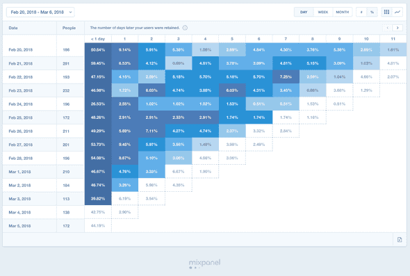
Because cohort analysis is one of the built-in features – click 'Retention' and your first cohort analysis chart is sitting there waiting for you:
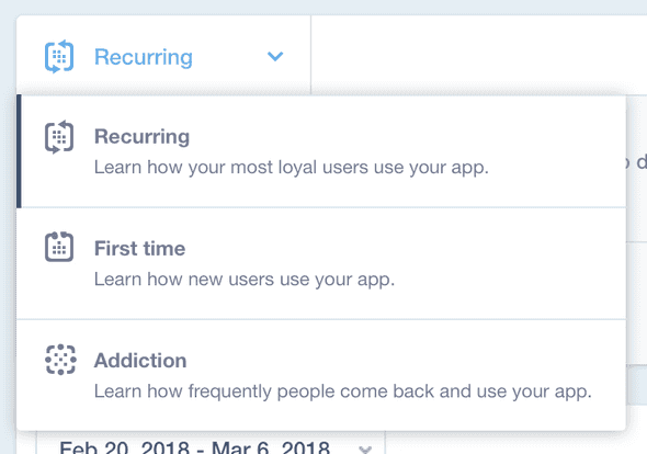
Like with Google Analytics, you can easily switch between date ranges and cohort sizes, but unlike Google Analytics, Mixpanel provides different types of built-in cohort analysis:
This neat menu allows you to examine how your first-time users behave differently from your most loyal users, which is a tremendous help when you're designing onboarding tools or improvement (and at Nickelled, we're all about those…).
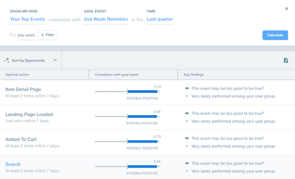
Finally, no discussion of Mixpanel should omit mention of their Signals dashboard, which is an incredible tool given that it's free:

Armed with user data, Signal pulls out events that correlate with higher retention (or any other event you want to track), giving you a near-instantaneous picture of the 'aha' moments that lead to success with your app.
Given that Mixpanel is free for most startup businesses, we'd heartily recommend it as an out-of-the-box cohort analysis solution.
Amplitude
We were pretty sweet on Amplitude for some time, and it's still an indispensable part of our workflow, but we'd recommend it with some caveats for cohort analysis.
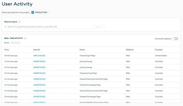
Like Mixpanel, Amplitude is easiest to set up in conjunction with Segment and will automatically record all user activity for you:
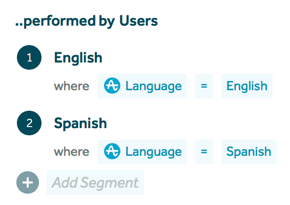
From there, it's dead simple to build useful charts on product usage and retention, thanks to the ridiculously simple chart builder, which has some segmenting capabilities built in that can be used to run a simple cohort analysis:
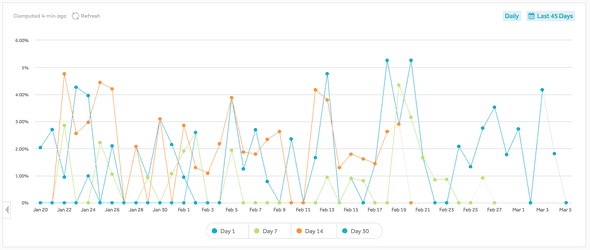
Amplitude also has a nice built-in retention dashboard, which gives us the Google Analytics style line graph:
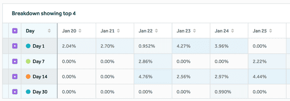
And below, we have a more traditional time-based cohort analysis:
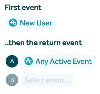
The nice thing about this is that you can select what you want the returning event to be – so in the case where you're looking for data on time-based cohorts that visited and signed up (instead of visiting and then visiting again), you can quickly select that in the graph:
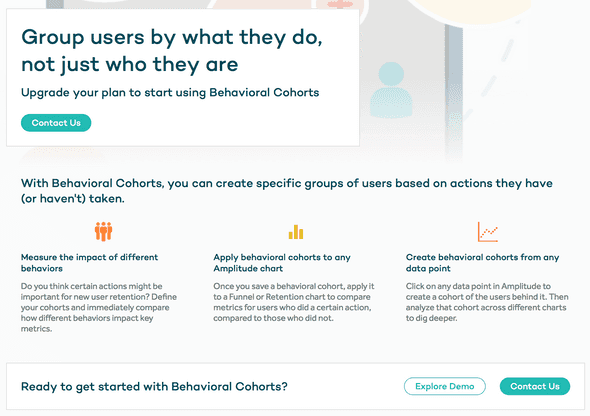
Here's the rub though. If you want to use Amplitude's behavioral cohorts functionality to cohort by anything other than time, you'll see this screen:
Yup, you need to upgrade your plan, and a little birdy tells us that ain't cheap, which means that we'd recommend Mixpanel over Amplitude for all but the most-established SaaS businesses.
Kissmetrics
We've never used Kissmetrics, but we're told that it's a popular choice for cohort analysis focused on website conversion events.
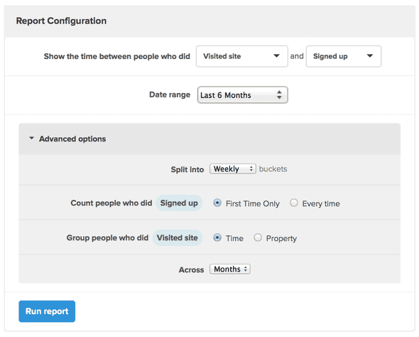
According to this blog post, Kissmetrics can run cohort analysis showing the interval between different events:
There's one nice feature here that's definitely on our list of things to check out; the ability to click on a cohort and see which users are in that group looks very useful.
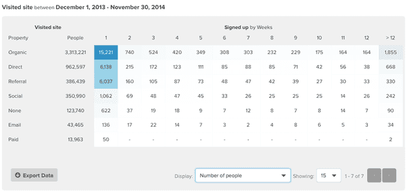
Kissmetrics also appears to be able to cohort by other groups too, including marketing channel as seen in this example:
Cohort analysis in SQL
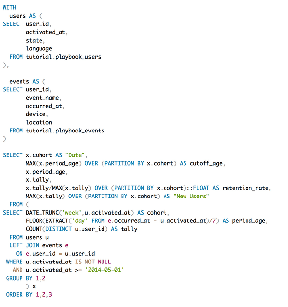
If you’re a whiz at SQL, building your own cohort analysis isn’t particularly difficult, particularly if you’ve got all of the data to hand. The following query is kindly provided by Mode Analytics (our analytics provider of choice) and serves as a great example of the kind of thing you’ll probably need:
Hopefully, you can see roughly what’s happening here — in the first section we’re setting up our metrics (users and events) before setting up the cohorts in the third section and calculating the users that had active events in a given week in the tally field.
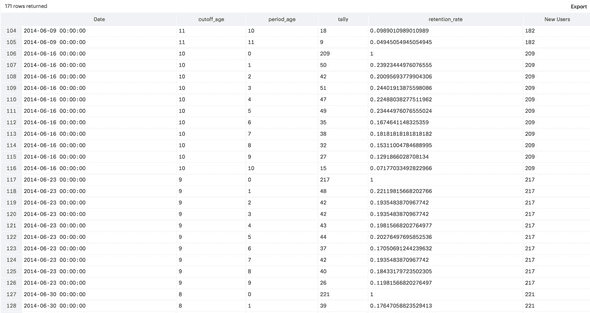
The result of the query above looks something like this:
… Which is a pretty cool insight into the raw data that goes into cohort analysis. That said, it’s a million miles away from a recognizable cohort analysis chart.
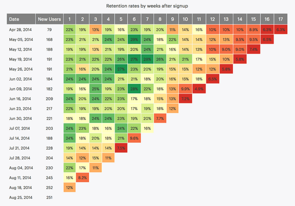
Getting it from the tabular format to something more recognizable is probably the hardest part of the whole setup - Mode have kindly shared their extensive javascript work which takes the table output and formats it in a more readable way (you can see it here):
Check out Mode’s full blog post on running cohort analysis in SQL here.
A more advanced version, using SQL and R to achieve a similar result, is described here.
Other tools to check out
Point Nine Capital Cohort Analysis Template
We're huge fans of the numbers-first approach the guys over at Point Nine Capital take to SaaS – if you haven't checked out their blog lately, have a read here because there's always some valuable stuff on there for SaaS entrepreneurs.
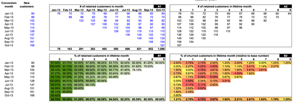
A few years ago, Christoph developed a spreadsheet for SaaS businesses designed to make cohort analysis pretty simple – you just have to paste in the data, and it will do the rest for you:
The post and the link to download are both available here on Andrew Chen's blog.
There's a fair amount of data to enter on this spreadsheet, and compared to the whizzy solutions we featured above; it's a little bit clunky. However, it has one compelling feature, which is that it provides numbers on revenue retention, as well as user retention.
For this reason, it's worth checking out if you need to do any form of accurate financial forecasting (as we discussed in the cohort analysis for SaaS businesses page).
It's also worth checking out the thoughts of Christoph's colleague Nicolas Wittenborn on Christoph's blog here, for a useful set of FAQs on cohort analysis. Look out for the common 'why didn't I think of that' gotchas, such as:
*How do I treat churn within the first month? *Should I treat team and individual accounts differently? *What about annual vs. monthly plans?
Chartmogul's PDF Guide
We love this cheat sheet on cohort analysis - easy to read and simply-written, it's the second-best thing on the internet when it comes to cohort analysis… :)
Conversion XL Post
Featuring a lot of input from Lincoln Murphy, this post is well worth a read on how to use cohort analysis to drive conversion optimization and which cohorts SaaS businesses should pay attention to.
Daisy Deng on Quora
Although we covered how to do cohort analysis in Google Sheets, the way Daisy had broken things down in this Quora post is worth checking out, especially if you weren't 100% sure on the methodology.
The Google Sheets example she used is here and is split down into the individual steps so you can easily see what's going on.
Fin
And that's it – the end of the road on our journey into cohort analysis.
We hope you found this guide useful – hit us up on @nickelledapp on Twitter and let us know, or drop feedback to team@nickelled.com.
We'd be remiss not to point out that great SaaS companies all over the world use Nickelled website walkthroughs to increase engagement and cut churn. Start your free trial at www.nickelled.com.

